

Photo by Nupo Deyon Daniel on Unsplash
Into the Compose-Verse: A Beginners Guide To Jetpack Compose: State Management


In whatever Android application we set out to build, we’re going to need to manage state, so understanding how best to manage state is vital. Luckily Jetpack Compose offers us simple and intuitive ways to manage state within our applications.
Jetpack compose is declarative and as a result, the only way to update a composable is by calling or recreating the same composable with different arguments. The arguments we pass into the composable often represent the state that we want to show the user. So whenever the state changes we essentially just redraw our composable with the new arguments.
Jetpack Compose supports state management using the remember and mutableStateOf APIs.
Before we dive into the details of these APIs there are 3 terms we need to understand and keep in mind
- Composition: a description of the UI built by Jetpack Compose, made by executing composable functions
- Initial Composition: The Initial creation of a composition. It is when Jetpack Compose executes the composable functions the first time
- Re-composition: The re-running or re-executing of Composables to update the composition
With these terms in mind, we can now proceed
Remember
With Jetpack Compose, we can store items in memory by using the remember composable. When we use this to store a value, that value is loaded into memory when the composable is being created for the first time.
Whenever the composable is recreated, the value stored in memory is returned to the composable.
Mutable State Of
The mutableStateOf API creates an observable MutableState<T> interface which contains a value.
Any change to the value will schedule the re-composition of any composable that reads that value
The combination of these 2 APIs, allow us effectively manage the state within our Composables. Let’s consider a simple example of the two APIs in action.
When creating an input field with jetpack compose, by default, it does not automatically update itself when the user enters text. To enable this we need to manually manage the state of the input and update its value whenever the user enters text, we can achieve this using a combination of mutable state and remember
@Composable
fun InputGreeting() {
    val text = remember { mutableStateOf("")}
    OutlinedTextField(
        value = text.value,
        onValueChange = {
            text.value = it
        }
    )
    Text(text = "Hello ${text.value}")
}
In the above snippet, we create our state variable called text, we specify that it is a mutable state variable and we also want to remember it.
Therefore our mutable state variable will be stored in the Composable’s memory and will be returned to it whenever re-composition occurs.
We set the value of our outlined text field to the value inside the state variable, and by doing so we are effectively reading from our state variable and will be notified whenever the state variable is changed
Whenever the user enters text into the outlined text field, the onValueChange function is triggered which will update the value within our state variable. When the value within the state variable is updated, it triggers a re-composition of any composable that reads from that state variable.
Finally, we output whatever the user inputs in the input field as a greeting
Therefore our composable will be re-composed with the new data which is the value of what the user has typed into the input field, this new value will then be fed to the outlined text field and will be displayed to the user.
It is important to note that none of the state management occurring with mutableStateOf will be possible without remember. The remember call ensures that when re-composition occurs we do not lose the value that we have stored. Without it, the entered user value will be lost on re-composition and the state variable will re-initialized to its default value, which is an empty string
Notes On State Management.
When composable uses remember to store a value, an internal state is created for that composable, and this makes the composable stateful. While this might be convenient, Composables with internal states tend to be less reusable and harder to test.
Another approach is to make the composable stateless, and simply pass in whatever state it needs to display as arguments to the composable. The easiest way to achieve this is with state hoisting
State Hoisting
This is a pattern in which we create two Composables, an outer composable and an inner composable. We place the state in the outer Composable which manages the state and passes the state to the inner composable as arguments. This way the outer Composable can share the state across multiple Composables. In addition to this, the inner Composable can also be more easily reused.
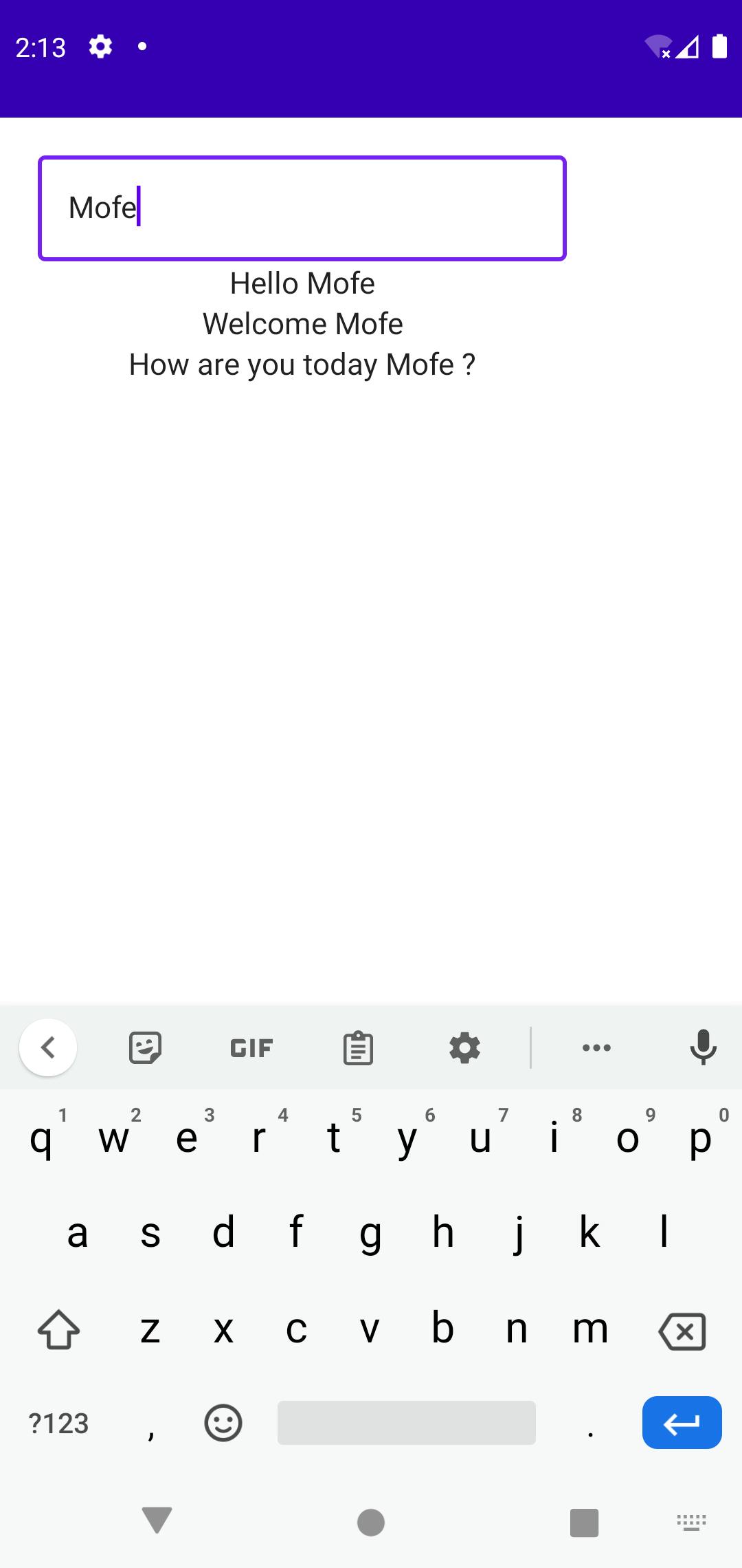
Let’s consider another example
@Composable
fun GreetingContainer() {
    val text = remember { mutableStateOf("") }
    InputGreeting(
        value = text.value,
        onValueChange = {
            text.value = it
        }
    )
    Question(value = text.value)
}
@Composable
fun InputGreeting(
    value: String,
    onValueChange: (String) -> Unit,
) {

    OutlinedTextField(
        value = value,
        onValueChange = onValueChange
    )
    Text(text = "Hello $value")
}
@Composable
fun Question(value: String) {
    Text(text = "How are you today $value ?")
}
In the above example, we moved our state from InputGreeting Composable to the GreetingContainer Composable.
The GreetingContainer now manages the state and passes the required state to InputGreeting as arguments. InputGreeting receives the value as well as a function to trigger to update the state onValueChange.
Our GreetingContainer also shares the same state with the Question Composable.
As we can see, using state hoisting allows us to manage the state for various Composables in one central location. It also allows us to share state across multiple Composables, and also ensures we have proper encapsulation. Our Question and InputGreeting Composables are decoupled from how the state is managed, and if we make changes to the GreetingContainer we do not need to make changes to either of them, provided we pass in the proper arguments.
The use of state hoisting implements the Unidirectional data flow pattern. In this pattern, state flows down from GreetingContainer to the inner Composables Question and InputGreeting and events flow up from InputGreeting to GreetingContainer
State Holders
While Internal state management and state hoisting can help us manage state within a small number of Composables effectively, It can get overwhelming when we are dealing with a large number of Composables, large state data and complicated logic. In such instances, it is advisable to employ state holders
A state holder is a class or file that manages logic and state of Composables, they own UI elements' state and UI logic. When a Composable contains complex UI logic that spans across the state of multiple Composables, it is best to employ state holders.
Let’s consider an example
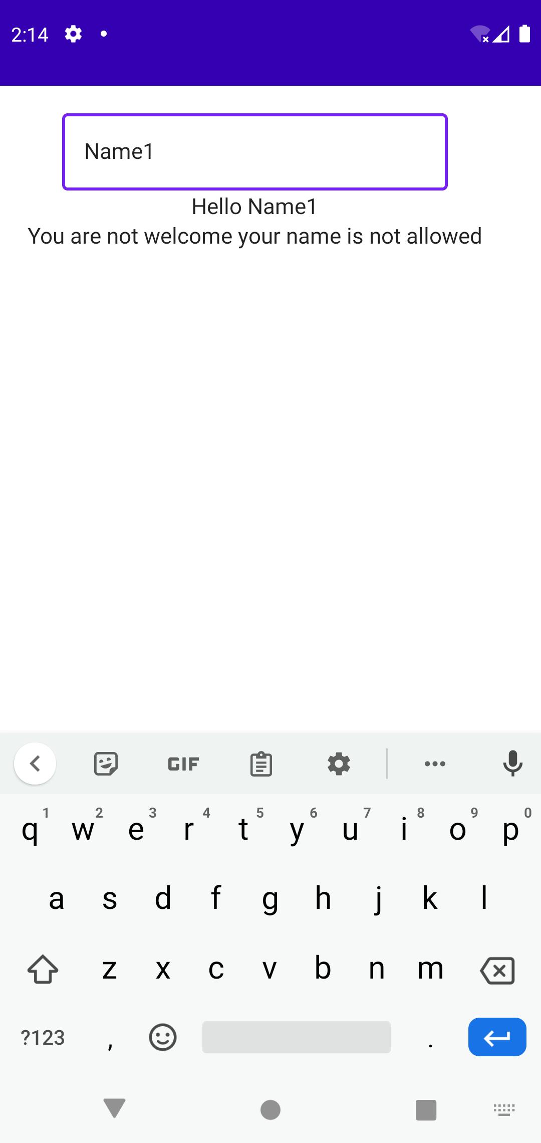
class ApplicationState(initialName: String) {
    private val rejectedNames: List<String> = listOf("Name1", "Name2", "Name3", "Name4")
    var name by mutableStateOf(initialName)
    val shouldDisplayName: Boolean
        get() = !rejectedNames.contains(name)
    val greeting: String
        get() = if (rejectedNames.contains(name)) {
            "You are not welcome your name is not allowed"
        } else {
            if (name.isNotEmpty()) {
                "Welcome $name"
            } else {
                ""
            }
        }

    fun updateName(newName: String) {
        name = newName
    }
}

@Composable
fun rememberApplicationState(initialName: String): ApplicationState = remember {
    ApplicationState(initialName = initialName)
}
In the state holder we created above, we have a list of rejected names as well a state variable that will hold the state of the name the user entered. We also have some custom logic that determines whether or not to display the entered name and what type of greeting to display.
Finally, we have a function that updates the state variable
State holders always need to be remembered to keep them in the composition and to prevent a new one from being created every time re-composition occurs
In our example we do this by creating a rememberApplicationState Composable which simply returns a remembered instance of our application state, we can use this composable in our other Composables E.g.
@Composable
fun CustomApplication() {
    val applicationState = rememberApplicationState(initialName = "")
    InputGreeting(value = applicationState.name, onValueChange = {
        applicationState.updateName(it)
    })
    if (applicationState.shouldDisplayName) {
        Text(text = applicationState.greeting)
        Question(value = applicationState.name)
    } else {
        Text(text = applicationState.greeting)
    }
}
In our CustomApplication above we are using the applicationState state holder to manage the entire state for the Composable. For our InputGreeting composable, we set the value to applicationState.name and for the onValueChange we pass in a Lambda which calls the updateName function from our state holder.
We also use the shouldDisplayName value from the state holder to perform some conditional rendering based on what name the user enters. If the entered name is allowed we display some values and if not we display another value.
ViewModels
View models are special kinds of state holders that are in charge of accessing other layers in the application such as the data layer or business layer and preparing the application data for display on the screen.
They survive configuration changes and can follow the lifecycle of the activities or fragments
They are best used with Screen-level Composables so that they can manage the state of the entire screen.
Let’s see an example of how they can be used in a practical example.
In the example, we will employ a combination of State holders and the view model to manage the state of a login form. This example shows a real-world application of the different means of state management within an application, so let’s begin
To begin let’s add the Jetpack Compose view model dependency
implementation "androidx.lifecycle:lifecycle-viewmodel-compose:2.4.0-beta01"
The first thing we need to handle is managing the state of an input field, so to do this we will create a data class that will be directly responsible for managing that state.
enum class InputType {
    TEXT,
    EMAIL,
    PASSWORD,
    NUMBER
}
data class InputState(
    val text: String = "",
    val isValid: Boolean = true,
    val type: InputType,
    val errorMessage: String = ""
)
The class above manages all the state related to an input field, including the actual value in the input field, whether or not the input field is valid, the type of the input field and the error message if any.
In most real-world use cases, input fields do not usually exist in isolation, they are usually grouped in a form, therefore let’s create another class that will hold the state of all the input fields within the form and will also hold the overall state of the form
data class LoginFormState(
    val email : InputState = InputState(type = InputType.EMAIL),
    val password: InputState = InputState(type = InputType.PASSWORD),
    val formValid: Boolean
)
Now that we have the state holders for the input state as well as the form state, we can create our view model. This view model will be in charge of managing and updating the overall state of the form as well as the state of the various input Composables
class LoginViewModel : ViewModel() {
    private val _state = mutableStateOf(LoginFormState(formValid = true))
    val state: State<LoginFormState> = _state
}
Our view model inherits from the ViewModel abstract class, then we create a state variable called _state this represents the overall state of the LoginForm
Note that we make our state variable private and it can only be accessed from within our LoginViewModel class, this is because our state is mutable and can be changed, we do not want the state to be modifiable from outside the class, so we make it private, but this also means that we cannot access the state outside of the class and as such, our Login screen has no access to the state.
To get around this we created another state variable called state this variable is of type State<T> which is the immutable variant of the jetpack compose state API. We override the getter of state to return an instance of our mutable state variable _state, so whenever state is accessed from outside the class, we return an immutable version of our _state variable.
Now that our state is set up, we need to create a way for our state variable to be modified from outside our loginViewModel. We do this with events. Following the Unidirectional data flow pattern, our state will flow down to our screen from our view model, and our screen will send events up to the view model to modify the date in our state.
Let's create our sealed class that will represent the events that the login screen will trigger to update our state values
sealed class LoginEvent {
    data class EnteredEmail(val value: String) : LoginEvent()
    data class EnteredPassword(val value: String) : LoginEvent()
    data class FocusChange(val focusFieldName: String) : LoginEvent()
}
Our LoginEvent consists of three data classes, one representing a situation where a user has typed in the email input field, another for the password input field and one for whenever focus changes on an input field. These data classes have a value field, which will be passed along to the view model
Now we need to create functions within LoginViewModel that can be used to handle the events which will come from our Login Screen. So we update the view model to have the following
class LoginViewModel : ViewModel() {
    private val _state = mutableStateOf(LoginFormState(formValid = true))
    val state: State<LoginFormState> = _state

    fun createEvent(event: LoginEvent) {
        onEvent(event)
    }

    private fun onEvent(event: LoginEvent) {
        when (event) {
            is LoginEvent.EnteredEmail -> {
                _state.value = state.value.copy(
                    email = state.value.email.copy(
                        text = event.value
                    )
                )
            }
            is LoginEvent.EnteredPassword -> {
                _state.value = state.value.copy(
                    password = state.value.password.copy(
                        text = event.value
                    )
                )
            }
            is LoginEvent.FocusChange -> {
                when (event.focusFieldName) {
                    "email" -> {
                        val emailValid = validateInput(state.value.email.text, InputType.EMAIL)
                        _state.value = state.value.copy(
                            email = state.value.email.copy(
                                isValid = emailValid,
                                errorMessage = "Email is not valid"
                            ),
                            formValid = emailValid
                        )
                    }
                    "password" -> {
                        val passwordValid = validateInput(
                            state.value.password.text,
                            InputType.PASSWORD
                        )
                        _state.value = state.value.copy(
                            password = state.value.password.copy(
                                isValid = passwordValid,
                                errorMessage = "Password is not valid"
                            ),
                            formValid = passwordValid
                        )
                    }
                }
            }
        }
    }

    private fun validateInput(inputValue: String, inputType: InputType): Boolean {
        when (inputType) {
            InputType.EMAIL -> {
                return !TextUtils.isEmpty(inputValue) && android.util.Patterns.EMAIL_ADDRESS.matcher(
                    inputValue
                ).matches()
            }
            InputType.PASSWORD -> {
                return !TextUtils.isEmpty(inputValue) && inputValue.length > 5

            }
            InputType.TEXT -> {
                // custom validation logic for text inputs
                return true
            }
            InputType.NUMBER -> {
                // custom validation logic for number inputs
                return true
            }

        }

    }
}
We have three new methods
createEvent is a public method that will be used by our screen to pass events to our view model.
onEvent is a private method that contains the custom logic to update the state variable, based on the type of event received as well as the value passed along with the event. In this method, we use when to determine what kind of event we received and perform the appropriate logic. when the event received is EnteredEmail or EnteredPassword we update the state value, by copying the values of the previous state into it and changing the email and password state fields respectively
When the event passed in is FocusChange we make a call to our utility method validateInput which simply contains our validation logic.
Note that we evaluate the field name passed in with the event and perform some validation, and update the form state based on the result of our validation.
Now let’s create a custom input field, which extends the OutlinedTextField Composable
@Composable
fun CustomInputField(
    value: String,
    placeholder: String,
    modifier: Modifier = Modifier,
    hasError: Boolean = false,
    errorMessage: String = "",
    onFocusChange: (FocusState) -> Unit,
    onValueChange: (String) -> Unit,
    textColor: Color = Color.Black,
) {
    val touched = remember {
        mutableStateOf(false)
    }
    OutlinedTextField(
        value = value,
        onValueChange = {
            touched.value = true
            onValueChange(it)
        },
        modifier = modifier.onFocusChanged {
            if (touched.value) onFocusChange(it);
        },
        isError = hasError,
        placeholder = {
            Text(
                text = placeholder, style = TextStyle(
                    textAlign = TextAlign.Center
                )
            )
        },
        colors = TextFieldDefaults.outlinedTextFieldColors(
            errorBorderColor = Color.Red,
            errorLabelColor = Color.Red,
            errorLeadingIconColor = Color.Red,
            textColor = textColor,
            focusedBorderColor = Color.Green,
            unfocusedBorderColor = Color.LightGray,
        ),

        shape = RoundedCornerShape(20),
    )
    if (hasError) {
        Text(
            text = errorMessage,
            color = Color.Red,
            modifier = Modifier.padding(start = 10.dp)
        )
    }
}
The Custom Input Field Composable simply extends the functionality of the Outlined Text Field to provide for displaying error messages, since that isn’t supported by the outlined text field.
Now that we have all our bits we can put them together on our login screen
@Composable
fun Login(
    loginViewModel: LoginViewModel = viewModel()
) {
    Column(
        modifier = Modifier
            .fillMaxSize()
            .padding(10.dp),
        horizontalAlignment = Alignment.CenterHorizontally,
    ) {
        val loginFormState = loginViewModel.state.value
        CustomInputField(
            value = loginFormState.email.text,
            placeholder = "Email",
            onFocusChange = {
                loginViewModel.createEvent(
                    LoginEvent.FocusChange("email")
                )
            },
            onValueChange = { value ->
                loginViewModel.createEvent(
                    LoginEvent.EnteredEmail(value)
                )
            },
            hasError = !loginFormState.email.isValid,
            errorMessage = loginFormState.email.errorMessage,
            textColor = Color.Black
        )
        Spacer(modifier = Modifier.height(20.dp))
        CustomInputField(
            value = loginFormState.password.text,
            placeholder = "Password",
            onFocusChange = {
                loginViewModel.createEvent(
                    LoginEvent.FocusChange("password")
                )
            },
            onValueChange = { value ->
                loginViewModel.createEvent(
                    LoginEvent.EnteredPassword(value)
                )
            },
            hasError = !loginFormState.password.isValid,
            errorMessage = loginFormState.password.errorMessage,
            textColor = Color.Black
        )
        Spacer(modifier = Modifier.height(10.dp))
        Button(
            onClick = {},
            modifier = Modifier
                .fillMaxWidth()
                .height(56.dp),
            colors = ButtonDefaults.buttonColors(
                backgroundColor = MaterialTheme.colors.primary,
                contentColor = Color.White,
                disabledBackgroundColor = Color.Gray
            ),
            shape = RoundedCornerShape(20),
            enabled = loginFormState.formValid

        ) {
            Text(text = "Login")
        }
    }
}
In our Login Screen, we accept an instance of our LoginViewModel as a param, and we initialize it by default.
Then we create a variable called loginFormState which references the state variable in our view model. We use this state variable to control our input fields.
Let’s take a closer look at one of the custom input fields
 CustomInputField(
            value = state.email.text,
            placeholder = "Email",
            onFocusChange = {
                loginViewModel.createEvent(
                    LoginEvent.FocusChange("email")
                )
            },
            onValueChange = { value ->
                loginViewModel.createEvent(
                    LoginEvent.EnteredEmail(value)
                )
            },
            hasError = !state.email.isValid,
            errorMessage = state.email.errorMessage,
            textColor = Color.Black
        )
In the input field above, we set the value to email.text this ensures that the value displayed in the input field is what is stored in our state. In the onFocusChange parameter, we pass in a Lambda, which calls the createEvent method from the loginViewModel the event we create here is a FocusChange event, this will trigger the validation from within the view model.
for the onValueChange parameter, we also pass in a Lambda which calls createEvent with an EnteredEmail event, we pass in the updated value from the user to the event as well
Next, we set the hasError param to be a negation of if the email field is valid, so if the email field is valid has error will be false, and if the email field is not valid, we set the has error parameter to be true. Then we set the errorMessage parameter to be the error message from the email state.
Finally, in our Button Composable, we disable the button if the form state’s isValid property is false.
Conclusion
When we run the application, we can see that the entire state for our from is effectively managed from within our view model. This makes our Login Screen easier to test, as it is effectively decoupled from the state management.
In addition to this, all of our state management is centralized in one place and is, therefore, easier to debug. Since the view model survives configuration changes, the state of our form will also survive configuration changes as well.
The Code samples used in this article be found here: Source Code