Into the Compose-Verse, A beginner guide to Android Development With Jetpack Compose: The Very Basics
Part 1: The very basics.
What was
Android development has been largely characterized by the view-based system of building android User interfaces. This approach involved defining UI elements and layouts as views in XML files, then rendering these views by inflating them, thus granting the user the ability to interact with them. The created views usually hold some state and views change the state depending on the user's interaction.
The above system seems like a good way to build applications, why then did it have to change, well the view-based approach has a couple of problems today:
It's very old. The Android view system was created over 10 years ago, and as a result, its APIs have started to show signs of ageing, the programming paradigms which largely influenced the view system are less prominent today. One prominent example that shows the ageing of the view system, is the fact that the View class which represents the basic building block for user interface components is over 30,000 lines long. The android toolkit team has even stated that the amount of code in this class had become unmanageable and as such needed to change.
User expectations for User Interfaces are growing. The various demands users have of user interfaces have largely grown since the time the android view system was introduced. Users prefer UI with animations, motions and these things were not particularly important when the view system was being developed originally.
Complexity. The view system involved writing the User Interface in XML, and the application logic in Java or Kotlin. This inevitably led to unintended complexity in managing the application. In addition to this, due to the nature of XML, we had to write longer lines of code to accomplish little things for example something as simple as changing the shape of a FAB or applying a gradient to a button would involve creating a drawable XML file and manually defining the gradient before applying it to our button.
No one likes XML ( I don't 😉)
What is
To solve the issues, the Android UI team introduced Jetpack Compose. Jetpack compose is Android's modern toolkit for building native UI. It simplifies and accelerates UI development on android and allows us to quickly bring our app to life with less code and intuitive Kotlin APIs.
Jetpack Compose is written entirely with Kotlin and offers us faster, simpler development in a single language, with fewer lines of code. It also comes with support with android studio and other jetpack items. Thus, our development speed is greatly increased. Jetpack Compose offers a declarative UI approach
What problems does compose solve?
Separation of Concerns: When using the view system, we usually have a tight coupling of various elements such as the application logic and the layout files. This can lead to unnecessary complexity in our code. When using jetpack compose both our layout and application logic is defined in the same language, the dependencies between our elements become more obvious as a result we can easily refactor and reduce the coupling of our elements together. Jetpack compose provides us with tools that allow us to better perform separation of concerns.
Brings the power of the kotlin language to our UI elements. Since Jetpack Compose is purely kotlin, it allows us to use language-level primitives that kotlin provides to do things dynamically eg using if-else statements to render parts of the UI, or easily executing complicated UI logic. While this was possible using the View system, it was inherently more complicated, as it involved firstly defining all the UI elements in the XML file then finding those elements via Id or view binding in an activity or fragment then performing our control flow logic there. In jetpack compose, we can do all of this in a single file and with less code.
Favors Composition over Inheritance. The view system was built upon inheritance, all UI elements inherit from the view class, and we could extend inbuilt views to create our custom elements, but this gives rise to all the issues associated with inheritance. In Compose, there is no single parent that we have to inherit from, all of our Ui elements are made up of other UI elements which we can switch or modify as we like.
Views vs Compose
Now that some of the theory is out of the way, let's look at a practical example of building a UI with the view system versus Jetpack Compose. We will be recreating the UI below with both the view system and Jetpack compose and then we can compare which one is more ideal, so let's get ready to rumble . . .
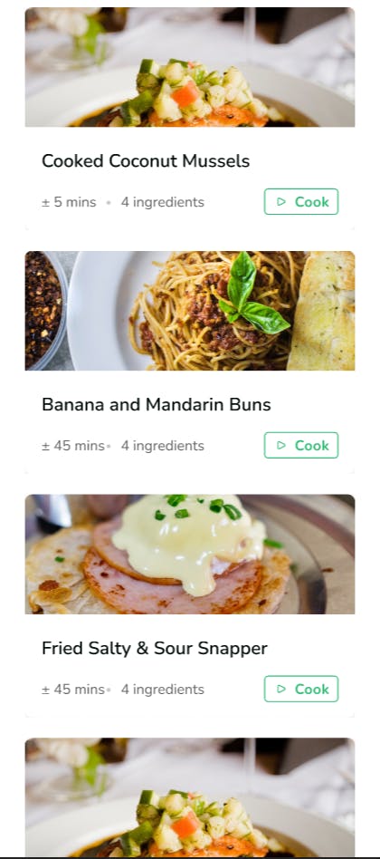
View System
To build the above UI using the view system, we will employ the following,
- Recycler View
- A custom View Adapter
- Google material card view
- Google Material Button
Step 1: Layouts
In our main activity XML, we add our recycler view and the necessary constraints
<?xml version="1.0" encoding="utf-8"?>
<androidx.constraintlayout.widget.ConstraintLayout xmlns:android="http://schemas.android.com/apk/res/android"
    xmlns:app="http://schemas.android.com/apk/res-auto"
    xmlns:tools="http://schemas.android.com/tools"
    android:layout_width="match_parent"
    android:layout_height="match_parent"
    tools:context=".MainActivity">
    <androidx.recyclerview.widget.RecyclerView
        android:id="@+id/main_recycler_view"
        android:layout_width="match_parent"
        android:layout_height="match_parent"
        app:layout_constraintBottom_toBottomOf="parent"
        app:layout_constraintLeft_toLeftOf="parent"
        app:layout_constraintRight_toRightOf="parent"
        app:layout_constraintTop_toTopOf="parent" />
</androidx.constraintlayout.widget.ConstraintLayout>
Next, create a layout for each card that will be on our list
<?xml version="1.0" encoding="utf-8"?>
<androidx.cardview.widget.CardView xmlns:android="http://schemas.android.com/apk/res/android"
    xmlns:app="http://schemas.android.com/apk/res-auto"
    xmlns:tools="http://schemas.android.com/tools"
    android:id="@+id/meal_card"
    android:layout_width="match_parent"
    android:layout_height="wrap_content"
    app:cardCornerRadius="10dp"
    app:cardElevation="5dp"
    app:cardUseCompatPadding="true">
    <LinearLayout
        android:layout_width="match_parent"
        android:layout_height="match_parent"
        android:orientation="vertical">
        <ImageView
            android:id="@+id/meal_image"
            android:layout_width="match_parent"
            android:layout_height="150dp"
            android:scaleType="centerCrop"
            tools:src="@drawable/pizza" />
        <TextView
            android:id="@+id/meal_name"
            android:layout_width="wrap_content"
            android:layout_height="wrap_content"
            android:paddingStart="10dp"
            android:text="Hello world"
            android:textSize="20sp"
            android:textStyle="bold" />
        <LinearLayout
            android:layout_width="match_parent"
            android:layout_height="wrap_content"
            android:gravity="bottom"
            android:orientation="horizontal"
            android:padding="10dp">
            <TextView
                android:id="@+id/meal_time"
                android:layout_width="wrap_content"
                android:layout_height="wrap_content"
                android:text="5mins"
                android:textSize="20sp" />
            <View
                android:layout_width="10dp"
                android:layout_height="match_parent" />
            <TextView
                android:id="@+id/meal_ingredients"
                android:layout_width="wrap_content"
                android:layout_height="wrap_content"
                android:text="4 ingredients"
                android:textSize="20sp" />
            <View
                android:layout_width="15dp"
                android:layout_height="match_parent" />
            <com.google.android.material.button.MaterialButton
                style="@style/Widget.MaterialComponents.Button.OutlinedButton"
                android:layout_width="wrap_content"
                android:layout_height="wrap_content"
                android:background="@android:color/white"
                android:drawableLeft="@drawable/ic_baseline_play_arrow"
                android:drawableTint="@color/green"
                android:text="cook"
                android:textColor="@color/green"
                android:textSize="15sp"
                app:strokeColor="@color/green"
                app:strokeWidth="20dp" />
        </LinearLayout>
    </LinearLayout>
</androidx.cardview.widget.CardView>
Step 2: Adapters
Create a custom adapter that will be used for our recycler view
class MealAdapter() : RecyclerView.Adapter<MealAdapter.ViewHolder>() {
    private var meals = emptyList<Meal>()
    class ViewHolder(binding: MealCardBinding) : RecyclerView.ViewHolder(binding.root) {
        val image = binding.mealImage
        val name = binding.mealName
        val time = binding.mealTime
        val noIngredients = binding.mealIngredients
    }
    override fun onCreateViewHolder(parent: ViewGroup, viewType: Int): ViewHolder {
        val binding: MealCardBinding = MealCardBinding.inflate(
            LayoutInflater.from(parent.context),
            parent,
            false
        )
        return ViewHolder(binding)
    }
    @SuppressLint("SetTextI18n")
    override fun onBindViewHolder(holder: ViewHolder, position: Int) {
        val meal = meals[position]
        holder.image.setImageResource(meal.image)
        holder.name.text = meal.name
        holder.time.text = "${meal.time} minutes"
        holder.noIngredients.text = "${meal.ingredients} ingredients"
    }
    override fun getItemCount(): Int {
        return meals.size
    }
    @SuppressLint("NotifyDataSetChanged")
    fun updateMeals(meals: List<Meal>) {
        Log.i("test", meals.toString())
        this.meals = meals
        notifyDataSetChanged()
    }
}
Step 3: View Models and State
We need a view model which will hold the data that will be displayed in our UI as well as a state class that for convenience, we will preload with some meal objects
The Meal model
data class Meal (val name: String, val time: Int, val ingredients: Int, val image: Int)
The Meal state
data class MealState(
    val meals: List<Meal> = listOf(
        Meal(
            name = "Cooked Coconut Mussels",
            time = 5,
            ingredients = 4,
            image = R.drawable.cookedcoconutmussels
        ),
        Meal(
            name = "Banana and Mandarin Buns",
            time = 45,
            ingredients = 6,
            image = R.drawable.bananaandmandarinbuns
        ),
        Meal(name = "Strawberry Meal", time = 59, ingredients = 3, image = R.drawable.strawberries),
        Meal(
            name = "Pizza",
            time = 50,
            ingredients = 7,
            image = R.drawable.pizza
        )

    )
)
The Meal View model
class MealViewModel : ViewModel() {
    private val _state = MutableLiveData(MealState())
    val state: LiveData<MealState>
        get() = _state
}
Step 4: Putting it all together
In our main activity class, we set up our recycler view with our adapter, and observe our note state
class MainActivity : AppCompatActivity() {
    private lateinit var binding: ActivityMainBinding
    private val mealViewModel: MealViewModel by viewModels()
    override fun onCreate(savedInstanceState: Bundle?) {
        super.onCreate(savedInstanceState)
        binding = ActivityMainBinding.inflate(layoutInflater)
        setContentView(binding.root)
        val adapter: MealAdapter = MealAdapter()
        binding.mainRecyclerView.adapter = adapter
        binding.mainRecyclerView.layoutManager = LinearLayoutManager(this)
        mealViewModel.state.observe(this, Observer { mealState ->
            adapter.updateMeals(mealState.meals)
        })
    }
}
The resulting UI looks like this
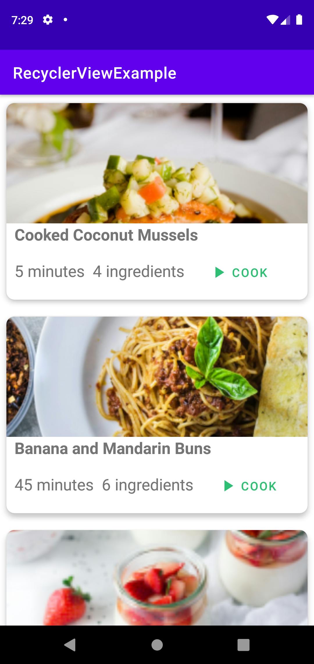
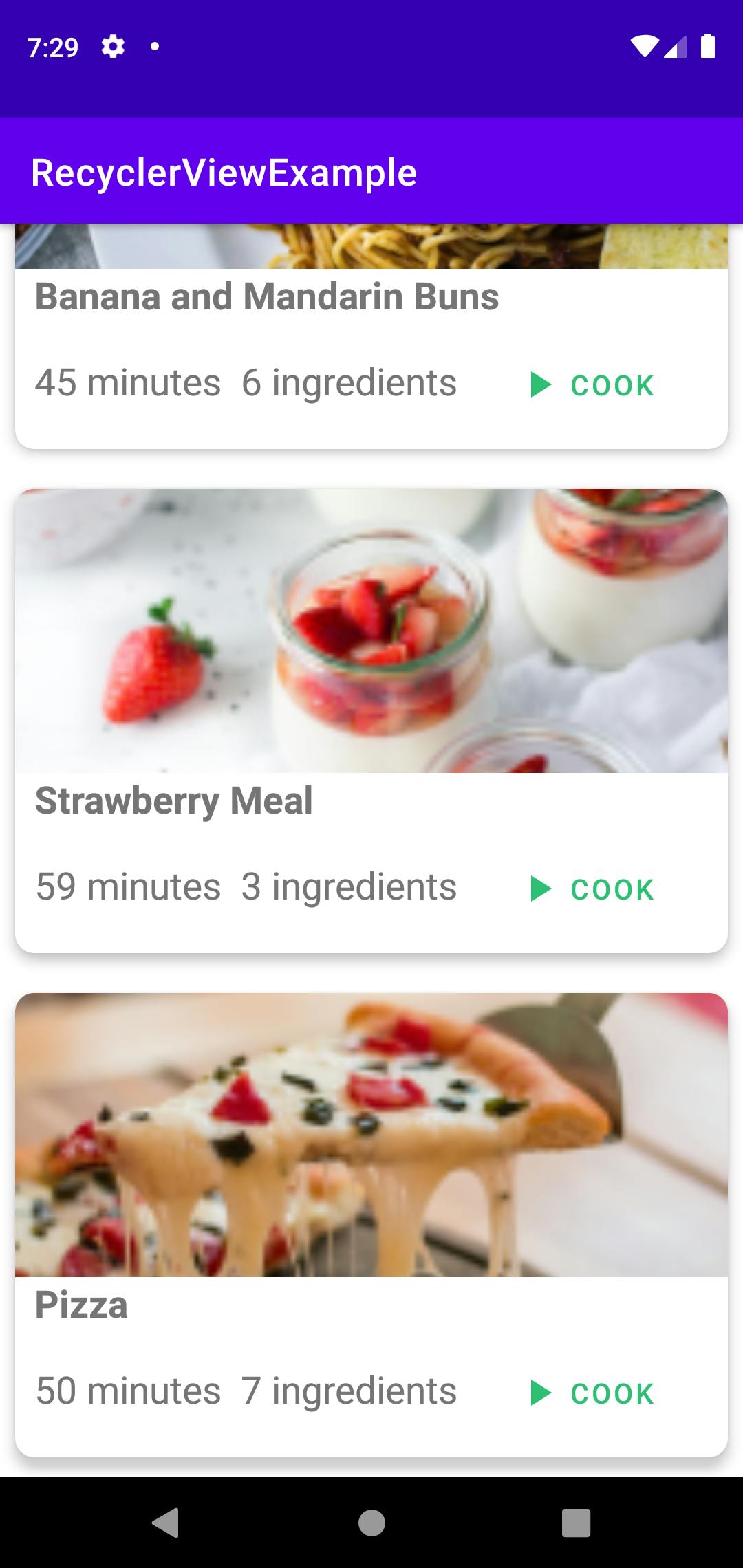
Jetpack Compose
To create a project with jetpack compose, open up Android Studio and select a new project and from the templates provided, select empty compose activity. This will generate a compose project for us with all the necessary dependencies setup.
Jetpack compose allows us to create our User interface with Composables. These are simple functions that are annotated with @Composable.
Once we have a composable function we can style or modify its behaviour with Modifiers. Modifiers are parameters we pass into the composable function which help us change how a composable is presented. We can use modifiers to do the following:
- Change the composable's behaviour and appearance
- Add information like accessibility labels
- Add high-level interactions like making an element clickable, scrollable, draggable or zoomable. They are quite similar to layout parameters in view based layouts.
To build our UI in jetpack compose, first add the following dependencies:
- Jetpack compose View model dependencies, to manage our UI data
- Material Icons
- Glide to handle images easily
Step 1: Add dependencies
In the project, the Gradle file add the following to the build script
    ext {
        compose_version = '1.0.1'
    }
Next in the application Gradle file
  //compose dependencies
implementation "androidx.lifecycle:lifecycle-viewmodel-compose:2.4.0-beta01"
implementation "androidx.compose.material:material-icons-extended:$compose_version"
implementation "com.github.skydoves:landscapist-glide:1.4.5"
Step 2: View models and State
data class Meal(
    val name: String,
    val image: Int,
    val ingredients: Int,
    val time: Int
)

data class MealState(
    val recipes: List<Meal> = listOf(
        Meal(
            "Banana and Mandarin buns",
            R.drawable.bananaandmandarinbuns,
            5,
            20
        ),
        Meal(
            "Cooked Coconut Mussels",
            R.drawable.cookedcoconutmussels,
            7,
            11
        ),
        Meal(
            "Fancy",
            R.drawable.feedimage2,
            9,
            11,
        ),
        Meal(
            "Italian",
            R.drawable.pizza,
            4,
            20
        ),
    ),
)

class MealViewModel : ViewModel(){
    private val _state = mutableStateOf(MealState())
    val state = _state
}
Note: In the view model, we are using mutable state instead of Live-data, this is because jetpack compose gives us a new state API which is similar to the live data API, however, we do not need to observe this state directly, Jetpack compose behind the scenes, subscribe any composable that reads from that state to any write operations emanating from that state. Thus, any composable that reads from the state object will be notified and redrawn with new data when modified.
Step 3: Create The Meal Card Composable
@Composable
fun MealCard(
    meal: Meal,
) {
    Card(modifier = Modifier.height(250.dp)) {

        Column(modifier = Modifier.fillMaxSize()) {
            Box(
                modifier = Modifier
                    .fillMaxHeight(fraction = 0.5f)
                    .fillMaxWidth()
            ) {
                GlideImage(
                    imageModel = meal.image,
                    contentDescription = meal.name,
                    modifier = Modifier
                        .matchParentSize()
                        .clip(
                            RoundedCornerShape(
                                topStart = 5.dp,
                                topEnd = 5.dp
                            )
                        ),
                    contentScale = ContentScale.Crop
                )
            }
            Spacer(modifier = Modifier.width(10.dp))
            Column(
                modifier = Modifier
                    .fillMaxWidth()
                    .padding(10.dp),
                ) {
                Text(
                    text = meal.name,
                    fontWeight = FontWeight(600),
                    fontSize = 18.sp
                )
                Spacer(modifier = Modifier.height(10.dp))
                Row(
                    modifier = Modifier.fillMaxWidth(),
                    horizontalArrangement = Arrangement.SpaceBetween,
                    verticalAlignment = Alignment.CenterVertically
                ) {
                    Row(
                    ) {
                        Text(text = "${meal.time} minutes", color = Color.Black)
                        Spacer(modifier = Modifier.width(10.dp))
                        Text(text = "${meal.ingredients} Ingredients", color = Color.Black)
                    }
                    OutlinedButton(
                        onClick = {},
                        border = BorderStroke(1.dp, Color.Green)
                    ) {
                        Row(verticalAlignment = Alignment.CenterVertically) {
                            Icon(
                                imageVector = Icons.Outlined.PlayArrow,
                                contentDescription = null,
                                tint = Color.Green
                            )
                            Text(text = "Cook", color = Color.Green)
                        }
                    }
                }
            }
        }
    }
}
In the Meal Card above, we use the inbuilt composables provided to build up our meal card composable, we also employ modifiers extensively to shape and style our custom composable to our desires. Some of the composables and modifiers we used above include
- Card: This is an inbuilt composable that comes with some default elevation and corner radius.
- Column: This arranges its content in a vertical column
- GlideImage: This the image composable from the glide library and it helps us display and style images
- Spacer: This simply creates some space between elements
- Row: This arranges its content in a horizontal row
Now to the best part, with Jetpack Compose you do not need to worry about creating recycler views or adapters whenever you need to render dynamically sized lists, you can simply use the lazy column or lazy row composables as shown below
@Composable
fun App(
    mealViewModel: MealViewModel = viewModel(),
) {
    val state = mealViewModel.state.value
    LazyColumn(modifier = Modifier
        .fillMaxSize()
        .padding(20.dp)) {
        items(state.recipes) { item: Meal ->
            MealCard(meal = item)
            Spacer(modifier = Modifier.height(16.dp))
        }
    }
}
Step 4: Put it all together in the main activity
class MainActivity : ComponentActivity() {
    override fun onCreate(savedInstanceState: Bundle?) {
        super.onCreate(savedInstanceState)
        setContent {
            JetpackComposeExampleTheme {
                App()
            }
        }
    }
}
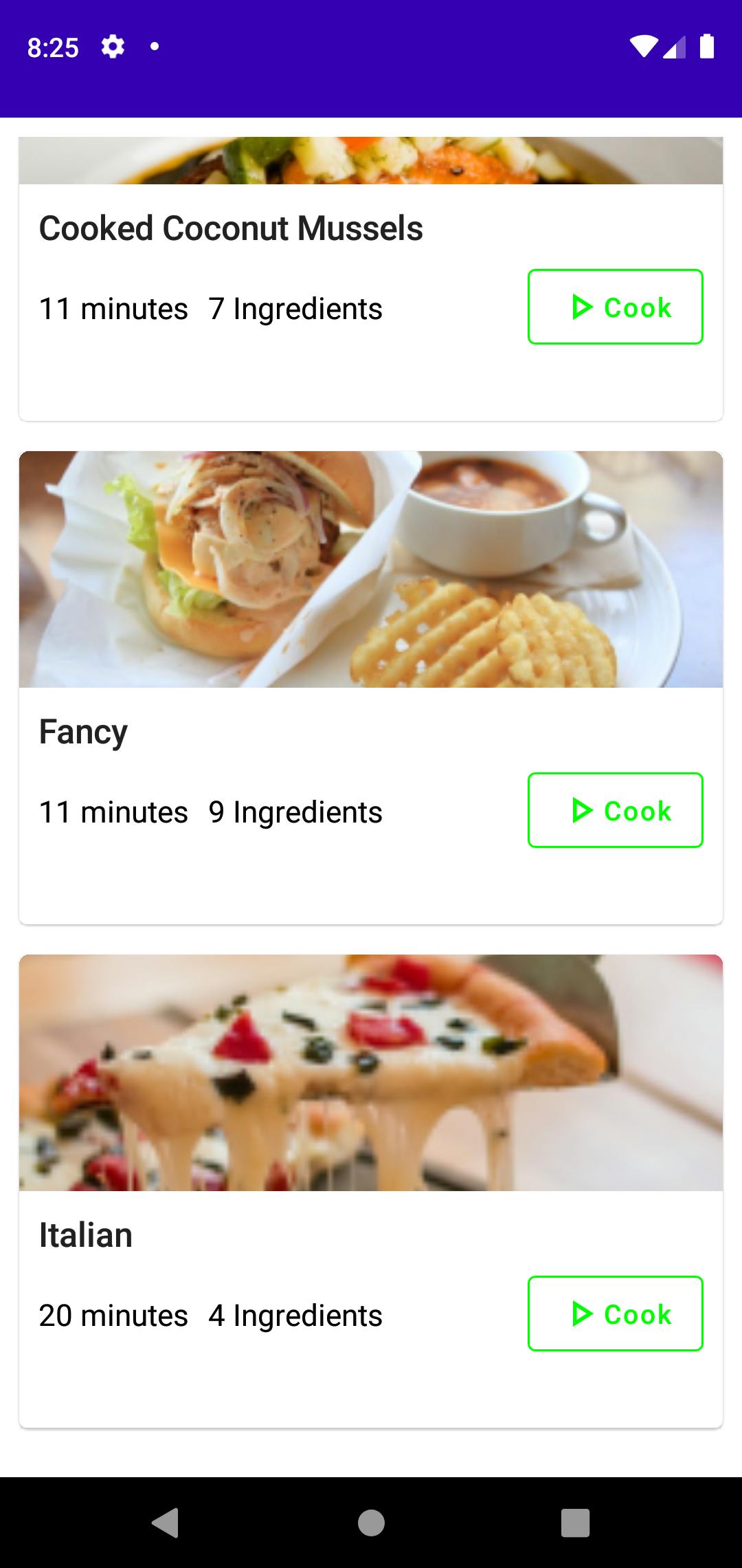
The resulting UI
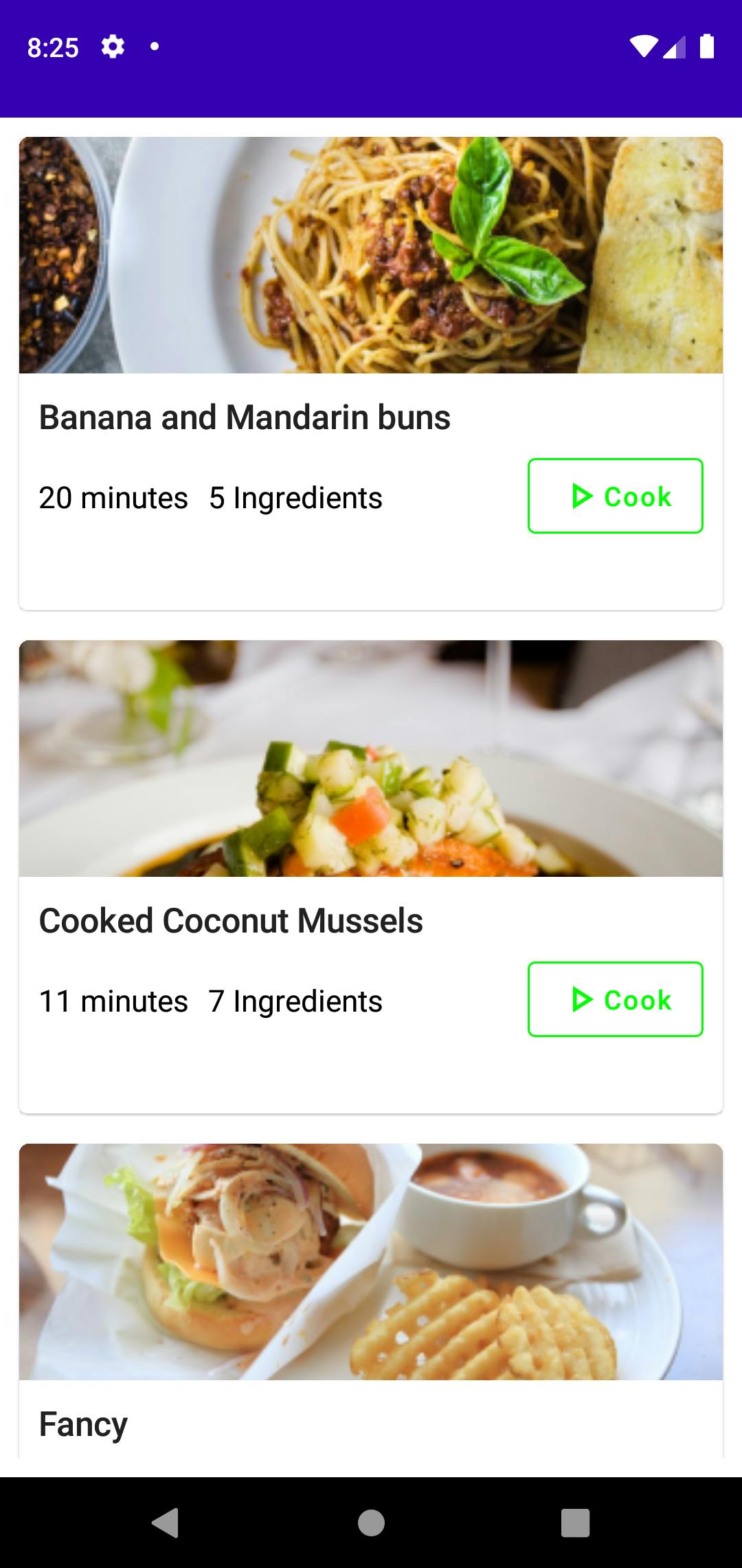
Verdict
As we can see Jetpack compose offers us a way to build declarative UIs with a single language. It allows us to leverage the power of Kotlin to create complex UIs with fewer lines of code and frees us to focus on other aspects of our application. The composable annotation, lets us build out our UI with distinct functions which we can swap out and manipulate as we please, and the state API provided with Jetpack compose provides us with an easier and more intuitive way of managing state within our applications.
The Code samples used in this article be found here: Source Code
