


Photo by Nick Morrison on Unsplash
Into the Compose-Verse: A Beginners Guide To Jetpack Compose: Composables and Modifiers.


Part 2: Composables and Modifiers
Jetpack Compose comprises two significant elements, composable functions, and modifiers.
Composables are simple functions that let us define our app’s UI programmatically. We express how our UI should look with kotlin code and pass in the data required by the UI as dependencies.
With Jetpack Compose, instead of worrying about UI initialization, e.g., inflating an XML layout file, we go directly into building our UI with Composable Functions. These composable functions are converted into UI elements behind the scenes. Jetpack Compose allows us to nest composable in one another, enabling us to combine the inbuilt Composables and create even more complex UIs.
Composables are broadly categorized into Single Composables, which generate a single UI element, and Layout Composables, which can group multiple Composables, much like how Views and View Groups operate under the View system.
Jetpack Compose also gives us the ability to change the appearance and behavior of our Composables by using modifiers. Modifiers are simply elements that allow us to decorate or add behaviors to our Compose UI elements. To use them, a composable has to accept a parameter of type modifier.
In this article, we will be exploring some of the most used Composables and modifiers. We will also be applying these Composables and creating the layout below.
 The UI above was created by Ashlee McKay, Check out her work
Common Composables and Modifiers
To get started with a new Jetpack Compose project, In Android Studio, create a new project and select the empty compose activity from the provided templates.
Jetpack Compose Offers us several Composables out of the box, but we can also create our own. We use the Composable annotation on a function to create a composable function. This composable function can hold other Composables e.g.
@Composable
fun Greeting(name: String) {
    Text("Hello $name!")
}
In the above example, we are creating a custom composable called Greeting. In our custom Composable, we have a Text Composable, which renders a text element onto the screen.
To view our composable, we need to tell android to display our Composable in our Main activity. As seen below, this is done in our main activity's onCreate method.
class MainActivity : ComponentActivity() {
    override fun onCreate(savedInstanceState: Bundle?) {
        super.onCreate(savedInstanceState)
        setContent {
            ComposablesAndModifiersTheme {
                Greeting(name = "Mofe")
            }
        }
    }
}
In the setContent lambda above, we have a ComposablesAndModifiersTheme lambda, this is another composable created for us by android, and it represents the Theme for our application. The name of the composable will depend on the name you set for your project. We will not go into themes in compose right now, so you can ignore it for now. When we run our project, we can see our text entry.
Jetpack Compose offers us a way to see how our Composables will look without launching the application in an emulator; this is done with the @Preview annotation.
@Preview(showBackground = true)
@Composable
fun DefaultPreview() {
    ComposablesAndModifiersTheme {
        Greeting("Android")
    }
}
In the above snippet, we create a new composable called DefaultPreview, which we annotated with the preview annotation. This allows us to preview the composable when we switch to the split view or design view in android studio. This saves us time as we don’t have to run the emulator to see changes.
We simply build the project, and the new changes will be visible in the preview panel.
To display multiple composables, we can use a layout composable, the most common of which are the Column and Row Composables; column allows us to display items vertically, while row allows us to display items horizontally.
@Composable
fun Greeting(name: String) {
    Column {
        Text(text = "Hello $name!")
        Text(text = "How are you ?")
    }
}
We can also nest rows inside columns and vice versa.
@Composable
fun Greeting(name: String) {
    Column {
        Row {
            Text(text = "Hello $name!")
            Text(text = "How are you ?")
        }
        Row {
            Text(text = "I am a nested row")
        }

    }
}
Which gives us

While Composables let us define our UI, we still need to style and arrange items within the UI. To achieve this, we use modifiers. In our column composable above, we can use a modifier to center the text elements on the screen and set the column's height and width. We declare modifiers via the Modifier interface and chain the desired modifier objects, eg.
@Composable
fun Greeting(name: String) {
    Column(
        modifier = Modifier
            .height(100.dp)
            .width(250.dp)
    ) {
        Row {
            Text(text = "Hello $name!")
            Text(text = "How are you ?")
        }
        Row {
            Text(text = "I am a nested row")
        }
    }
}
In the above snippet, we use the height and width modifiers to set the height and width of our parent column. We use chaining to apply multiple modifiers at once.
Jetpack Compose offers us a host of modifiers we can use to effect our desired layout; for example, instead of manually setting the width and height of the column, we can use the fillMaxHeight() or fillMaxWidth() to let our column fill the max available height and width.
@Composable
fun Greeting(name: String) {
    Column(
        modifier = Modifier
            .fillMaxSize()
            .padding(20.dp),
        verticalArrangement = Arrangement.Top
    ) {
        Row(
            modifier = Modifier
                .background(Color.Red)
                .fillMaxWidth()
                .height(100.dp)
        ) {
            Text(
                text = "Hello $name!",
                fontSize = 30.sp,
                fontWeight = FontWeight.Bold
            )
            Spacer(modifier = Modifier.width(20.dp))
            Text(
                text = "How are you ?",
                fontSize = 30.sp,
                fontWeight = FontWeight.Bold
            )
        }
        Spacer(modifier = Modifier.height(30.dp))
        Row(
            modifier = Modifier
                .background(Color.Green)
                .fillMaxWidth()
                .height(100.dp)
        ) {
            Text(text = "I am a nested row")
        }
    }
}
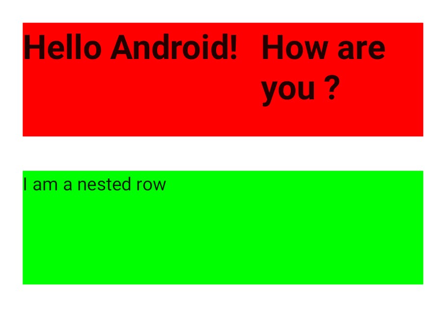
We use several Composables and Modifiers in the above snippet, so let’s go through them.
In our Column Composable applied the following modifiers:
fillMaxSize(): This ensures that our column fills the maximum available width and height; since the column is the parent Composable, this means that it will fill the entire screen
padding(): This adds padding around the column; we specify the padding amount to be 20 dp
In the column, we also provide the vertical Arrangement parameter; this param specifies how the contents of the column should be arranged vertically.
In our Row Composables, we use the background modifier to set its background color; we use the fillMaxWith() modifier to fill the available width, and the height() modifier sets its height.
We set its size and weight in the Text composable using the fontsize and fontWeight properties.
Finally, we used the Spacer Composable to create a space between different Composables.
In our preview tab, we have the following result.
Putting It All Together
Now that we’ve covered some of the basics of Composables and Modifiers let’s apply them and build the UI.
Ps. I couldn’t find the exact Illustrations in the UI sample, so I replaced them 😀
Welcome Screen
@Composable
fun Welcome() {
    Column(
        modifier = Modifier
            .padding(top = 40.dp, start = 20.dp, end = 20.dp, bottom = 10.dp)
            .fillMaxSize(),
        horizontalAlignment = Alignment.CenterHorizontally

    ) {
        Image(
            painter = painterResource(id = R.drawable.bubble_gum_body_with_phone),
            contentDescription = "Welcome Illustration"
        )
        Spacer(modifier = Modifier.height(30.dp))
        val textSize = 30.sp
        Text(
            text = "Growing your",
            fontSize = textSize,
        )
        Row {
            Text(
                text = "business is ",
                fontSize = textSize,
            )
            Text(
                text = "easier",
                fontSize = textSize,
                color = Color.Blue
            )
        }
        Text(
            text = "than you think!",
            fontSize = textSize
        )
        Spacer(modifier = Modifier.height(15.dp))
        Text(text = "Sign up takes only 2 minutes")
        Spacer(modifier = Modifier.height(100.dp))
        Button(
            onClick = { /*TODO*/ },
            modifier = Modifier.fillMaxWidth().height(50.dp),
            colors = ButtonDefaults.buttonColors(
                backgroundColor = Color.Black,
                contentColor = Color.White
            ),
            shape = RoundedCornerShape(20)
        ) {
            Text(text = "Get Started")
        }
        Spacer(modifier = Modifier.height(10.dp))
        Button(
            onClick = { /*TODO*/ },
            modifier = Modifier.fillMaxWidth().height(50.dp),
            colors = ButtonDefaults.buttonColors(
                backgroundColor = Color.LightGray,
                contentColor = Color.Black
            ),
            shape = RoundedCornerShape(20)

        ) {
            Text(text = "Sign in")
        }
    }
}
For the Welcome Composable, our parent composable is a column to arrange items vertically.
We applied padding and fillMaxSize modifiers to it to add some space within the column and ensure that the column fills the entire screen. Then we set the horizontalAlignment of our column to Alignment.CenterHorizontally; this ensures that all elements in the column will be centered horizontally.
Next, we have an Image Composable; we set its painter param to a painter resource and pass in the image's id to be used in the image composable. The painter resource loads the image from our drawable folder into our image composable.
Next, we have a spacer composable to add some space after the image and a series of text Composables.
Note that for the “business is easier” text, which has two different colors, we use two separate text Composables and use a row to place them side by side, then manually set the colors.
Next is our Button Composable; the on click param is empty lambda, but ideally, the function we want to execute when the button is clicked should be placed here.
We also add the fillMaxWidth() and height() modifiers to set the width and height of the button. To set the color of our button, we override use buttonColors() method of the ButtonDefaults object and pass in the values we want to use for our background color and content color. The color values we pass into this method are default Color objects provided by Jetpack Compose.
Finally, we override the button's shape by passing calling the RoundedCornerShape() function with the value 20; this value represents the percentage by which we want the corners of the button to be rounded. The function will create a Rounded Corner Object and pass it to the shape param of our button.
In our main activity, we can replace our Greeting() Composable with Welcome().
class MainActivity : ComponentActivity() {
    override fun onCreate(savedInstanceState: Bundle?) {
        super.onCreate(savedInstanceState)
        setContent {
            ComposablesAndModifiersTheme {
               Welcome()
            }
        }
    }
}
Running our application now gives us the result below.

Login Screen
@Composable
fun Login() {
    val username = remember { mutableStateOf("") }
    val password = remember { mutableStateOf("") }
    Column(
        modifier = Modifier
            .padding(top = 40.dp, start = 20.dp, end = 20.dp, bottom = 10.dp)
            .fillMaxSize(),
        horizontalAlignment = Alignment.CenterHorizontally

    ) {
        Image(
            painter = painterResource(id = R.drawable.bubble_gum_body_with_phone),
            contentDescription = "Login Illustration"
        )
        Spacer(modifier = Modifier.height(20.dp))
        Text(
            text = "Welcome back!",
            fontSize = 30.sp,
            fontWeight = FontWeight.Bold
        )
        Spacer(modifier = Modifier.height(10.dp))
        Text(
            text = "You've been missed",
            color = Color.Gray
        )
        Spacer(modifier = Modifier.height(10.dp))
        Button(
            onClick = { /*TODO*/ },
            modifier = Modifier
                .height(60.dp)
                .fillMaxWidth(),
            colors = ButtonDefaults.buttonColors(
                backgroundColor = Color.LightGray,
                contentColor = Color.Black
            ),
            shape = RoundedCornerShape(20)
        ) {
            Row(
                modifier = Modifier.fillMaxSize(),
                verticalAlignment = Alignment.CenterVertically,
            ) {
                Spacer(modifier = Modifier.width(10.dp))
                Image(
                    painter = painterResource(id = R.drawable.icons8_google),
                    contentDescription = "Google Login"
                )
                Spacer(modifier = Modifier.width(10.dp))
                Text(
                    text = "Sign In With Google",
                    fontSize = 20.sp
                )
            }
        }
        Spacer(modifier = Modifier.height(10.dp))
        Row(
            modifier = Modifier.fillMaxWidth(),
            verticalAlignment = Alignment.CenterVertically
        ) {
            Divider(
                modifier = Modifier
                    .height(1.dp)
                    .width(150.dp), color = Color.Gray
            )
            Spacer(modifier = Modifier.width(15.dp))
            Text(text = "or", color = Color.LightGray)
            Spacer(modifier = Modifier.width(15.dp))
            Divider(
                modifier = Modifier
                    .height(1.dp)
                    .width(150.dp), color = Color.Gray
            )
        }
        Spacer(modifier = Modifier.height(10.dp))
        OutlinedTextField(
            value = username.value,
            onValueChange = { newValue -> username.value = newValue },
            modifier = Modifier.fillMaxWidth(),
            placeholder = {
                Text(text = "Username")
            }
        )
        Spacer(modifier = Modifier.height(10.dp))
        OutlinedTextField(
            value = password.value,
            onValueChange = { newValue -> password.value = newValue },
            modifier = Modifier.fillMaxWidth(),
            placeholder = {
                Text(text = "Password")
            },
            trailingIcon = {
                Icon(
                    painter = painterResource(id = R.drawable.ic_baseline_remove_red_eye_24),
                    contentDescription = "Toggle Passowrd"
                )
            }

        )
        Spacer(modifier = Modifier.height(10.dp))
        Button(
            onClick = { /*TODO*/ },
            modifier = Modifier
                .fillMaxWidth()
                .height(50.dp),
            colors = ButtonDefaults.buttonColors(
                backgroundColor = Color.Black,
                contentColor = Color.White
            ),
            shape = RoundedCornerShape(20)
        ) {
            Text(text = "Login")
        }
        Spacer(modifier = Modifier.height(5.dp))
        Row(
            modifier = Modifier.fillMaxWidth(),
            horizontalArrangement = Arrangement.Center
        ) {
            Text(text = "Don't have an account? ", fontSize = 16.sp)
            Text(text = "Sign up here", color = Color.Blue, fontSize = 16.sp)
        }

    }

}
Our Login Screen looks a lot more complicated than our welcome screen but let’s break it down.
The first lines of our screen have the following lines.
val username = remember { mutableStateOf("") }
val password = remember { mutableStateOf("") }
Composable functions can store values in memory using remember{}. The value passed to remember is stored in the Composable’s memory when the composable is initialized for the first time. Whenever the composable is redrawn for any reason, the composable can still access that value.
mutableStateOf() creates an observable mutable state object, any changes to the state object, will trigger the redraw or re-composition of any composable that reads from that state object.
Thus we can use both remember and mutableStateOf to manage the internal state within a composable.
In the above snippet, we create a mutable state object that holds an empty string that is the initial state of our username and password input fields.
The mutable state object is passed on to remember which stores them in the internal memory of the composable, and we then assign the state object to a variable. By doing this, we are subscribed to the state object, and whenever the state object changes, the composable will be redrawn with the new value. In addition, because we used remember when the composable is redrawn with the latest data, we do not lose the data because it is stored in the Composable's internal memory.
It is important to note that while remember{} stores the value in the Composables internal memory, it does not survive configuration changes, i.e., when the device is rotated, or process death occurs. If we want our state to survive configuration changes, we use rememberSaveable{}
After our state variables, we create a column with the modifiers to fill the max size and padding values on the top, start end, and bottom after our state variables.
Within our Column, we have an image tag, which holds the main illustration for our page some text Composables with Spacers between them.
Next, we have our “Sign in with google button” note that we nest a row within the button. This is because we want to have an image next to the button's text. Jetpack Compose allows us to nest composables inside other composables so we can place a row inside the button to achieve this.
Next, we are able to create the dividers with the text 'or' between them by using a row; in that row, we use the two divider Composables with a text composable between them.
For our input fields, we use the Outlined Text Field Composable. This composable has two important params, the value and onValueChange.
We pass in our state variables as the value for the input field, and for the onValueChange param, we pass in a lambda that updates the value of the state variable to what the user has currently typed in the input field.
This will update our state variable, which will trigger a re-composition, and the input field will de be redrawn with the new value entered by the user. The Input field will then be fed the new value in the state variable, because we set the value param to the state variable.
Finally, we have our login button and a row of text composables, which prompt the user to log in if he already has an account.
In our main activity, we replace our Welcome() Composable with Login
class MainActivity : ComponentActivity() {
    override fun onCreate(savedInstanceState: Bundle?) {
        super.onCreate(savedInstanceState)
        setContent {
            ComposablesAndModifiersTheme {
//               Greeting(name = "Mofe")
//                Welcome()
                Login()

            }
        }
    }
}
The resulting UI

Conclusion
We’ve seen our we can create simple and complex layouts using a mixture of Composables and modifiers. The Composables and Modifiers we used in the examples above are a small number of the numerous ones provided for us by the Jetpack Compose team, and you can always read the docs to discover more. Jetpack Compose Docs Jetpack Compose Docs: Modifiers
The Code samples used in this article be found here: Source Code